The Complete Progress Tracking Manual
Stop optimizing dashboards for looking green. Start designing them to surface slippage early. A field manual on the metrics, dashboards, and weekly rituals that catch real problems before they become incidents.
A dashboard that's always green is a dashboard nobody is reading.
There's a strange thing about most company dashboards: they look great and tell you nothing. Bright green numbers, smooth-rising charts, and not a single piece of information that would make you change what you're doing this week. This guide is about how to fix that — how to design tracking that surfaces problems early enough to act on, and how to build the team habits that make the tracking matter.
The seven parts below walk through the full system: what to measure, how to display it, when to look at it, who should care, and what changes when the numbers move. Skip ahead via the TOC, or read end-to-end on a Sunday afternoon — it's long, but every section earns its place.
Part 1 — Why most metrics fail
Companies pick metrics the same way teenagers pick outfits: copy something that looked good somewhere else. A SaaS company adopts NPS because Drift talks about it. A startup obsesses over MRR because YC tweets about it. The result is dashboards full of metrics that nobody on the team can act on. Acting on a metric requires three things: you have to be able to influence it, you have to see it before the situation becomes critical, and you have to know what to do when it moves. Most metrics fail at least one of those tests.
The vanity metric tax
Vanity metrics are the ones that look impressive in board decks and produce nothing. Total signups (when most never activate). Total page views (when most are bots). Twitter followers (when none of them convert). These metrics aren't useless — they have their place — but treating them as primary makes you optimize for activity instead of outcomes. The cure is to pair every vanity metric with its accountability metric. Total signups paired with D7 activation. Page views paired with read-rate. Followers paired with CTR on linked content. The pair is honest; either alone is propaganda.
Progress Tracking with Dashboards That Don't Lie
The shorter version of this whole guide, in case you only have 6 minutes.
Part 2 — Leading vs lagging indicators
If you only learn one distinction from this guide, learn this one. Lagging indicators tell you what already happened. Leading indicators tell you what's about to happen. Revenue is a lagging indicator — it reflects work done 30 to 90 days ago. Trial-to-paid conversion is the corresponding leading indicator — it tells you what revenue will look like in 30 days. Optimize for leading indicators and you'll be acting on tomorrow's information today. Optimize for lagging indicators and you're managing through a rear-view mirror.
The lagging→leading swap table
- Revenue (lagging) ↔ Trial-to-paid conversion + sales pipeline health (leading by 30-60 days).
- Churn rate (lagging) ↔ Weekly active days per customer + support ticket volume per account (leading by 60-90 days).
- Customer NPS (lagging) ↔ First-response time + resolution rate + ticket sentiment (leading by 30-45 days).
- Project slip (lagging) ↔ Cycle time trend + stalled-task count (leading by 2-3 weeks).
- Engineering velocity (lagging) ↔ Code-review wait time + on-call interruption count (leading by 2 weeks).
- Employee retention (lagging) ↔ Weekly 1:1 sentiment scores + voluntary commitment time (leading by 3-6 months).
Use this table as a starting point. The right leading indicator depends on your business — the swap above gives you the shape of what to look for. Spend a week with your team identifying the leading indicators for your top three lagging metrics. The exercise alone is worth a quarter of casual dashboard-building.
Leading Indicators Beat Lagging Ones — Every Time
The shorter, sharper version focused on the lagging→leading swap.
Part 3 — The 5-widget dashboard
Most dashboards have too many widgets. The team adds 'just one more' metric until the page is a wall of charts nobody scans. The cure is a hard rule: five widgets, one screen, ninety seconds to read. Five forces you to make hard choices about what actually matters. One screen means no scrolling, no tab-switching, no escape. Ninety seconds means the dashboard is read habitually — at the start of every weekly review, by everyone in the room.
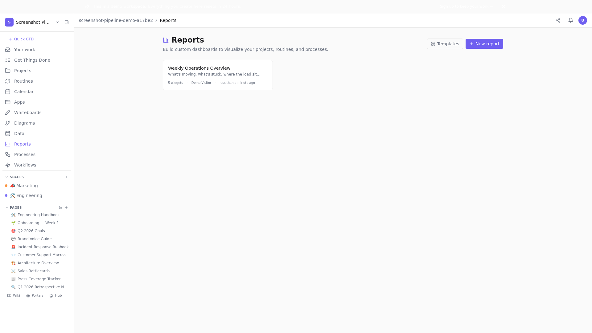
The five-widget anatomy
- Three metric tiles — your most-important leading and lagging numbers. Each shows current value + change vs. last week. Color the change (green up, red down) only when up/down is unambiguously good/bad.
- One trend chart — a single key metric over the last 8-12 weeks. The shape of the line is the message; don't bury it under five overlapping series.
- One breakdown chart — a bar chart showing the slice that matters: tasks by assignee, revenue by segment, signups by channel. Ordering matters — sort descending.
That's it. No funnels with seven steps. No cohort tables. No three-dimensional grouped stacks. Five widgets — three numbers, two charts. If you can't fit your dashboard into that shape, you're either tracking the wrong things or you have multiple dashboards pretending to be one.
Part 4 — Cycle time, deeply
If you only track one operational metric — make it cycle time. Cycle time is the wall-clock duration from when a task moves to 'in progress' to when it moves to 'done'. It's brutally honest. Story points can be gamed (just inflate them). Throughput depends on team size (more people = more done). Cycle time is the time it actually takes work to flow through your system. It can't be gamed without obviously doing less work.
What good cycle time looks like
- Engineering tasks: median under 5 days, P90 under 10 days. Anything over 14 days needs investigation.
- Support tickets: median under 2 business days, P90 under 5 days.
- Design: median under 10 days, P90 under 20 days. Design naturally takes longer because of iteration.
- Marketing campaigns: median under 14 days for content; under 30 days for paid campaigns with creative cycles.
Reading cycle time drift
Cycle time rarely spikes overnight. It drifts upward over weeks — and that's the signal worth catching. Watch the trend over 8 weeks. If the median has gone up by 30%+ over two consecutive weeks, something has changed in how work flows. Common causes: one person took on too much (WIP overload), an upstream dependency slowed down (waiting time inflated), or scope per task expanded silently (tasks that used to be 2 days are now 4 days because they're secretly bigger). Each cause has a different fix; you can't fix without diagnosing.
Cycle Time: The Only Velocity Metric That Matters
The sharp version: why story points fail and cycle time doesn't.
Part 5 — Owner balance: the hidden bottleneck
A single overloaded owner can drop the entire team's productivity by 40% without anyone realizing. The pattern: one person has 12+ in-progress tasks, half of them are blocked on them, but they're heads-down so they don't surface that they're underwater. Two weeks pass; cycle time on dependent tasks balloons; the team feels slow but can't point to why.
The rules of thumb
- Healthy WIP per owner: 3-8 active tasks. Above 10, attention quality drops sharply.
- Above 12: stop adding work. Redistribute or cut scope before anything new is assigned.
- Above 15: you have a sustained pattern. Have a 1:1 same day to ask what they need.
Why people get overloaded silently
Three causes, in order of frequency: they're senior enough that asking-for-help feels like weakness; the team has implicitly normalized 60-hour weeks; or they're the only person who knows X. The first is a culture issue; the second is a leadership failure; the third is a hiring or knowledge-sharing failure. All three are fixable, but only when the dashboard makes the overload visible enough that the conversation happens.
Part 6 — The weekly tracking ritual
Metrics without ritual are decoration. Build the dashboard, then build the habit of looking at it every Friday — same time, same room, same five widgets. The first time you skip it, you've started losing. The second time you skip it, the ritual is dead.
The 45-minute weekly review structure
- 0-10 min: read the dashboard silently. Each person writes down one observation they didn't have last week.
- 10-25 min: any number that's red, the owner explains the cause + the next action. Written, not waved away.
- 25-40 min: customer + team signals not in the numbers. Three wins + three concerns + three risks.
- 40-45 min: one ask each — what does each function need from the others next week?
The 45-Minute Weekly Business Review
The shorter version of the WBR ritual, in case you want a printable agenda.
Part 7 — When metrics lie
Sometimes a green dashboard hides a real problem. Three classic patterns: Simpson's paradox (the average improves while every segment gets worse — you've added more weighting to the better segment); survivorship bias (your retention numbers look great because everyone who would've churned already did); and lagging-only blindness (your dashboard shows lagging metrics that look fine while leading metrics quietly degrade). All three are common; all three are catchable if you know to look.
Defensive practices
- Always look at segment-level data alongside the aggregate. If aggregate is up but more than half of segments are down, you have Simpson's paradox.
- Track cohort retention, not aggregate retention. Aggregate hides the deterioration.
- For every lagging metric on the dashboard, pair it with at least one leading metric. If they diverge, the leading one is telling the future.
Part 8 — Quarterly metric reviews
The weekly ritual catches drift. The quarterly review catches metric obsolescence. Once a quarter, ask: are these still the right five widgets? A metric that mattered last quarter might be solved (and now its widget is just decoration). A new metric should probably replace it. Healthy companies cycle 2-3 widgets per quarter; static dashboards mean static thinking.
The retire-replace exercise
Open the dashboard. For each widget: when did we last act on this? If the answer is 'we haven't, we just look at it', retire it. Replace it with a metric that, if it moved, would change a decision you'd make next week. If you can't think of one, that's the signal that you've outgrown your dashboard and need a half-day strategy session to redefine what matters this quarter.
Closing
Progress tracking isn't an end in itself. It's the loop that keeps your team honest with itself about how it's actually doing — separate from how it feels like it's doing. Build the loop. Keep it small. Look at it weekly. Update it quarterly. Everything else is window dressing.
If your dashboard never has a red number, your team is either heroic or your numbers are wrong.Open the demo's seeded dashboard and try the five-widget structure on real content.
Related posts
Progress Tracking with Dashboards That Don't Lie
Most progress dashboards optimize for looking green. We optimize for surfacing slippage. Here's how to build dashboards in Tellzm that catch real problems early.
Cycle Time: The Only Velocity Metric That Matters
Story points are gameable. Throughput depends on team size. Cycle time is honest. Here's how to track it in Tellzm and what to do when it drifts.
Leading Indicators Beat Lagging Ones — Every Time
Revenue is a lagging indicator. Churn is a lagging indicator. By the time they move, the cause was three months ago. Track leading ones instead.
The 45-Minute Weekly Business Review
Most WBRs run 90 minutes and accomplish 30 minutes of work. Here's how to cut the fat without cutting the rigor.